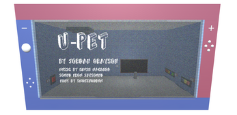
U-Pet
U-Pet
-WASD to Move, Mouse to look, F to interact-
Play with a virtual buddy! Poke around your pet room, change the color of the walls and eat some delicious snacks!
Your mouse cursor is hidden within the game screen. Press escape or delete and move it off the screen to reveal it again. Click back in the screen to hide.
Video rendering is not supported in WebGL, so one one wall of the room there is a still image instead. If you would like to see the game with the video player, please use the windows or mac builds.
This game was made in 9 days. Design, programming, and modeling by Jordan Grayson. Song by Kevin Macleod. Font 'Refusetrip' by John Bloor. Sound Effects from Zapsplat.com. Textures from sketchuptextureclub.com.
Backbay Lounge by Kevin MacLeod
Link: https://incompetech.filmmusic.io/song/3408-backbay-lounge
License: http://creativecommons.org/licenses/by/4.0/
Refusetrip by John Bloor
http://www.johnbloor.co.uk/
| Status | Released |
| Platforms | HTML5, Windows, macOS |
| Rating | Rated 4.0 out of 5 stars (1 total ratings) |
| Author | JordanGrayson |
| Genre | Simulation |
| Made with | Unity |
| Tags | Cute, First-Person, Virtual Pet |

Comments
Log in with itch.io to leave a comment.
Wow this concept is such an interesting twist on the virtual pet genre! I find it so interesting that the player is in the position of the pet as opposed to being the pet owner. The button clicks and intractability of the mouse cursor felt really good in this game, but also the mood buttons did confuse me a bit, because the changes felt fairly subtle compared to the other buttons.
The part that interests me the most is actually your take on the UI cursor. The way it hints for interactable object with a natural transform in shape without having to change color or shape just feel oddly smooth. I can see how this design wiil be even more useful in games that uses single color aesthetics.
However, while I get you might be making this decision for the perspective (the closer the bigger), it feels a bit odd to have the dot "unfocus" to suggest interactablity while you are supposed to have your attention focus onto an object.
Also, putting the cursor as an actual game object in world space causes it to disappear if I run into walls. I suggest putting it into the actual UI Canvas if that's not intended.
That’s actually a really good point I hadn’t thought of. I’d want to try it first, but I think having the cursor be a ring and then focus down to a point when you look at an interactable object is a really good idea that makes intuitive sense in my head now that you mention it. Thanks, I will definitely keep that in mind for the future.
The cursor as it is is inspired by the way cursors work in a lot of VR games I’ve played if you want to look to there for other examples. :)
And you are right, I should have put the cursor on the UI canvas.
Glad you enjoyed the game, thanks for playing! I appreciate the feedback.
This is a very creative concept! I love the feel of the controls, and the mechanics. One big critique I have though is that sometimes my camera does go through objects, and my vision gets messed up. Also I do wish that I could drown myself in food.
This is such a cool idea for a virtual pet game, it might be my favorite I've seen so far. The static texture and sharpness of the 3d objects cements this very 90s style that reminds me a lot of pocket virtual pets like tamagotchi and cube world, is that coincidental or did you directly reference those properties? Either way, very cohesive style! I don't know if this is because of itch or the actual game, although I assume it's itch, but i felt like a lot of the movement and gameplay was a bit laggy, and I wasn't in control of what buttons I was pressing. Maybe consider making the room a bit smaller so the laggy-ness of the movement has less impact on the overall gameplay?
Hey, Thanks
Tamagotchi was definitely part of my starting place for general concept as well as the visuals, so I'm glad that comes across! Building to WebGL definitely introduced a significant amount of lag, I think it has to do with my implementation of the physics in regards to the food - making the room smaller sounds like a good potential workaround for that. Initially I made the room the size it is so that you would have to walk back and forth for a not insignificant distance as a lot of the keychain pet games I've played often include the pet moving from one side of the screen to the other.
I appreciate the feedback and thanks for playing!
Really cool game ! I love the idea of playing as the pet, and the gigantic, ominous human looking over you is super cute and fun.
The mirror is cool, and I like the idea of changing your mood, but I cant figure out if the Mood actually does anything ? Maybe if it changed your appearance so you can see yourself change in the mirror or something. For a week dev period, it's great. I'd love to imagine some more stuff you could do as the pet, but then again the life of a pet is pretty mundane lol. Nice job :]
Thank you so much! That is a good idea to have the mood reflect somehow on the visuals, I think it would work well if it changed the color of your character. Right now, rating your mood just affects the equation that calculates the emotions of the "player" and how often they decide to interact by sending you food themselves.
I'm so glad you enjoyed it!